What's new

New Kit 2014-15

ajspurs

Well-Known Member
Jul 7, 2007
23,220
31,552
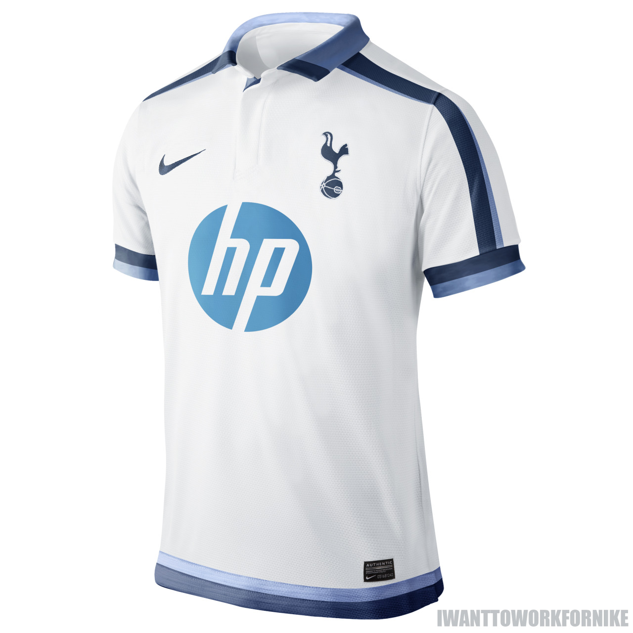
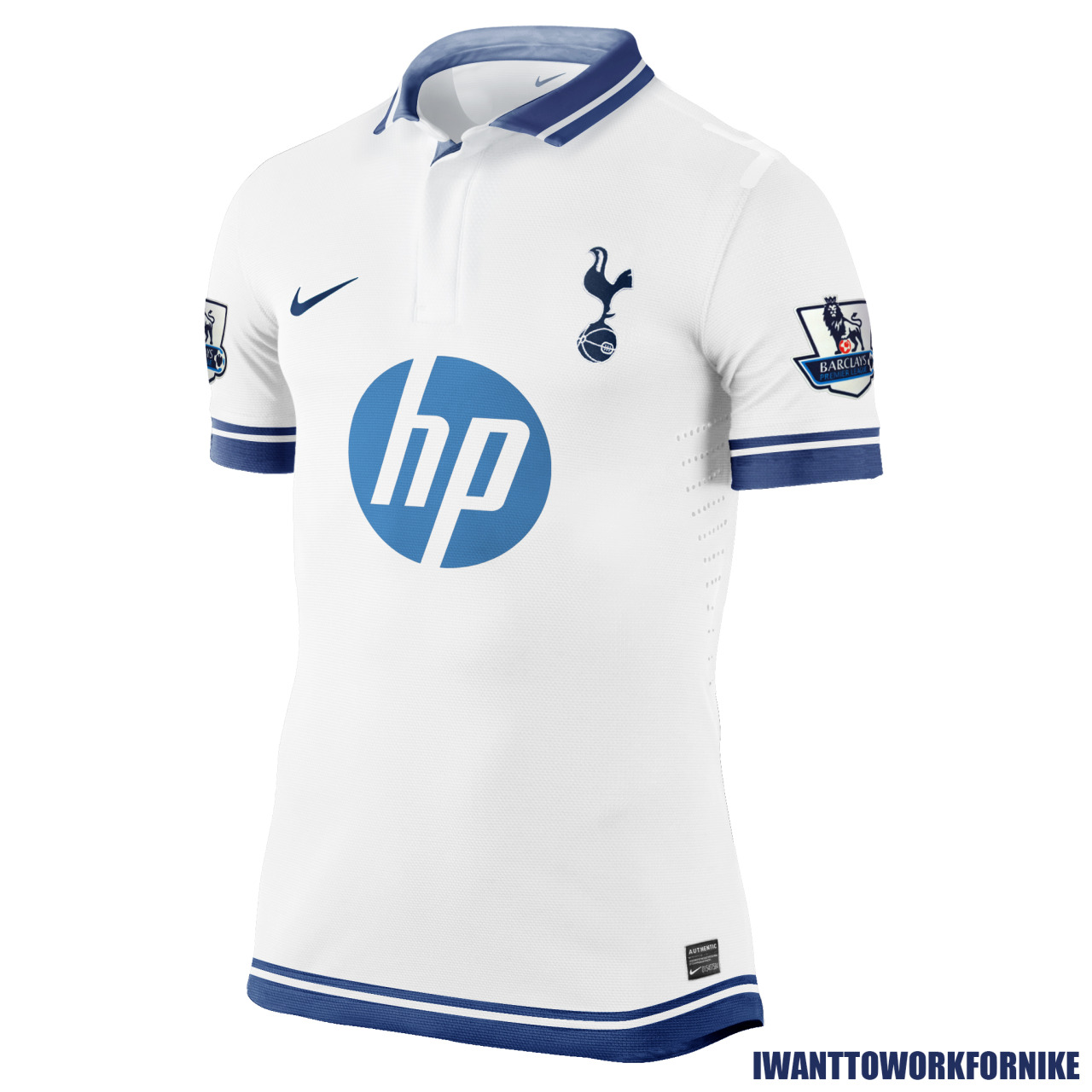
I quite like both change strips now to be honest. Not sure I like them enough as just shirts and to buy, but as a whole kit I think they're really nice and just look to be good quality too.

I still want that blue away one from UA's first season with us, don't think I'll ever get that :(
 

jonathanhotspur

Loose Cannon
Jun 28, 2009
10,292
8,250
3rd kids are always only sold by the club.
Not sure how long they last, remember a few from Puma that sold out quick and fans were unhappy.

UA might have supplied more, or just not as big a demand for them...
There was a black one and a brown one when we were sponsored by Mansion that were massive hits, IIRC.
 

TwanYid

Well-Known Member
Aug 1, 2013
1,223
3,484
Have you come around yet? :LOL:

Kind of.

The home kit is kind of ok, in a whole-is-greater-than-the-sum-of-its-parts kind of way. In other words, it's an ugly shirt (childishly simple, ugly logo replete with red lettering, yellow stripes which don't belong, an absurd pattern around the collar and too much business/too much going on, colors clashing, etc., etc.) yet I somehow don't hate it on the players. That's what got me- it could have been a beautiful shirt if they didn't try to do so much (and if they changed the logo from red to navy blue!). I wouldn't buy it, but it's not terrible. It's kind of Oriental, which I understand given the sponsor.

The away kit is another case of trying to do too much; take away those God-awful yellow skid marks and you'd be left with one of the nicest shirts we've ever produced. Unfortunately, they are there- which sucks. Again- not something I would ever purchase.

The 3rd kit is gorgeous. Perfect (for a third kit). Everything I like-- streamlined, simple, classic, good-looking. Basically, a case where the designers got out of their own way. I will 100% be buying that one.

Now just imagine how that kit would look were you to change the yellow to navy blue and the lettering to white- you'd have another unreal kit. In fact, I wish they'd taken the 3rd kit template and made three separate kits using the same template throughout but merely changing the colors: home would be white base with navy blue stripes and lettering, away would be navy blue base with white stripes and lettering, 3rd would remain exactly how it is.

Now that would've been a kit to be proud of, and there'd be three of 'em hanging in my closet. Well actually six- considering the fact that I'd have to get my two-year-old son all three versions as well!
 
Last edited:

faymantaray

Average-Sized Member
Apr 19, 2005
5,577
8,507
Kind of.

The home kit is kind of ok, in a whole-is-greater-than-the-sum-of-its-parts kind of way. In other words, it's an ugly shirt (childishly simple, ugly logo replete with red lettering, yellow stripes which don't belong, an absurd pattern around the collar and too much business/too much going on, colors clashing, etc., etc.) yet I somehow don't hate it on the players. That's what got me- it could have been a beautiful shirt if they didn't try to do so much (and if they changed the logo from red to navy blue!). I wouldn't buy it, but it's not terrible. It's kind of Oriental, which I understand given the sponsor.

The away kit is another case of trying to do too much; take away those God-awful yellow skid marks and you'd be left with one of the nicest shirts we've ever produced. Unfortunately, they're there- which sucks. Again- not something I would ever purchase.

The 3rd kit is gorgeous. Perfect (for a third kit). Everything I like-- streamlined, simple, classic, good-looking. Basically, a case where the designers got out of their own way. I will 100% be buying that one. Now just imagine how that kit would look were you to change the yellow to navy blue and the lettering to white- you'd have another unreal kit. In fact, I wish they'd taken the 3rd kit template and made three separate kits using the same template throughout but merely changing the colors: home would be white base with navy blue stripes and lettering, away would be navy blue base with white stripes and lettering, 3rd would remain exactly how it is.

Now that would've been a kit to be proud of, and there'd be three of 'em hanging in my closet. Well six actually, considering I'd have to get my two-year-old son all three versions as well.

Sorry for my awful photoshop but I've given it a try, maybe we can get the gist..


TwanYid

Well-Known Member
Aug 1, 2013
1,223
3,484
Sorry for my awful photoshop but I've given it a try, maybe we can get the gist..


Thanks for trying- I don't know anything about Photoshop so it's not like I could've done better...

Someone on here did our kit like I imagined- current 3rd kit style, merely changing yellow to white and it looked amazing. I'll try and dig up the post.

**EDIT**: Haha it was you!!! Here:

Bu2ue47CQAEza4r.jpg-large-2.jpeg


I would buy that shirt in a New York second! Seriously that is one of the nicest things I've ever seen! Why couldn't we have just done this?!?
 
Last edited:

DaSpurs

Well-Known Member
Jan 20, 2013
11,816
13,655
My gawd if that were our home my lady would have to chloroform me and fight my still-resisting subconscious if she ever wanted to remove it for cleaning.
 

guiltyparty

Well-Known Member
Sep 21, 2005
9,023
13,524
Thanks for trying- I don't know anything about Photoshop so it's not like I could've done better...

Someone on here did our kit like I imagined- current 3rd kit style, merely changing yellow to white and it looked amazing. I'll try and dig up the post.

**EDIT**: Haha it was you!!! Here:

View attachment 16988

I would buy that shirt in a New York second! Seriously that is one of the nicest things I've ever seen! Why couldn't we have just done this?!?

I tackled this earlier in the thread. Because home kits aren't made primarily for existing purchasers. They're made to attract new buyers and to please the sponsor. Is why classic fans always seem to like one of the away kits - that's who it's targeted at. But you don't want all 3 to sell to the same market, you want to spread your bets.

And we don't seem to have the power/interest in stopping red appearing. I get that AIA's logo is red and they've paid a lot of money and will have insisted it was red on the shirt. And the moment Barclays or PayPal (Or HP again) sponsors us, we'll have a blue logo on the shirt but it will be their corporate pantone, not Spurs blue. This is just something to accept in the modern age, I think. That said, AIG, Utd's old sponsor, always had a blue logo but that was never inflicted upon them so it can be negotiated.
 

faymantaray

Average-Sized Member
Apr 19, 2005
5,577
8,507
Thanks for trying- I don't know anything about Photoshop so it's not like I could've done better...

Someone on here did our kit like I imagined- current 3rd kit style, merely changing yellow to white and it looked amazing. I'll try and dig up the post.

**EDIT**: Haha it was you!!! Here:

View attachment 16988

I would buy that shirt in a New York second! Seriously that is one of the nicest things I've ever seen! Why couldn't we have just done this?!?

Can't take the credit! I found that image on twitter.
 

TwanYid

Well-Known Member
Aug 1, 2013
1,223
3,484
Can't take the credit! I found that image on twitter.

Well, then you deserve credit for finding it and bringing it on here! That's a seriously cool image- a PERFECT demonstration of just how beautiful our kit could be had anyone taken the time/had the wherewithal to get it right! Instead we have our mishmash, all-over-the-place kit, which is ok...but which is certainly not streamlined and beautiful.

I would be interested to see the sell-through #s on this season's kit; I'll bet they're are a lot of "no thank you"s...a bunch of "uh, it's ok- but I'll pass"...whereas everyone and their MOTHER would've bought that version you grabbed off Twitter,,,literally, everyone. That's a perfect kit! All from a guy good at Photoshop!

Now could someone please mock-up the navy-and-white version so we can drool over that one?!?
 
Last edited:

DaSpurs

Well-Known Member
Jan 20, 2013
11,816
13,655
see, now i don't particularly like that kit. i think white and navy is too colourless, it has no life to it. these are the best mock spurs shirts i've seen:

Ideally I'd like for us to stick with yellow trim, but with the red it's just plain awful. I still think of Fisher-Price every time I see us don the homes. So IMO, while we have this deal with AIA and it's forced color, I wish we should stick with just white and navy or black/gray. White, navy, and red has always been an attractive color combination, so aside from our subjective distaste for the color of red it's making the best of the situation.
 
D

Deleted member 27695

Well I love the home kit, think it's the nicest in a good few seasons. So go on...stone me!
 

TwanYid

Well-Known Member
Aug 1, 2013
1,223
3,484
see, now i don't particularly like that kit. i think white and navy is too colourless, it has no life to it. these are the best mock spurs shirts i've seen:

The one pictured above on Kaboul is "lifeless" and "colorless?" Wow- I totally respect your opinion but I don't agree at all; I find that to be one of the nicest, sleekest most beautiful shirts I've ever seen. I LOVE it!

Btw, the ones you posted (the "Nike" mockups) are great as well. I especially like the first one.

Anyway can we all agree that these mockup versions trump the real thing by a mile? I am not a fan of our current home and away kit. Only the 3rd kit is nice imo-- it's the only one I'd actually buy.
 

Blake Griffin

Well-Known Member
Oct 3, 2011
14,162
38,452
The one pictured above on Kaboul is "lifeless" and "colorless?" Wow- I totally respect your opinion but I don't agree at all; I find that to be one of the nicest, sleekest most beautiful shirts I've ever seen. I LOVE it!

Btw, the ones you posted (the "Nike" mockups) are great as well. I especially like the first one.

Anyway can we all agree that these mockup versions trump the real thing by a mile? I am not a fan of our current home and away kit. Only the 3rd kit is nice imo-- it's the only one I'd actually buy.

it looks anaemic to me, white and navy need another colour to make them pop, the two alone on that shirt looks horrible to me, i prefer what we have now - although i do see @DaSpurs fisher price point. i prefer this mock up:

index.php


the red is subtle enough that it makes white and navy work without overpowering it.
 

faymantaray

Average-Sized Member
Apr 19, 2005
5,577
8,507
I would never buy anything with a sponsorship advert splashed all over it. So that rules out me ever buying a kit. But that's another discussion.
 

faymantaray

Average-Sized Member
Apr 19, 2005
5,577
8,507
it looks anaemic to me, white and navy need another colour to make them pop, the two alone on that shirt looks horrible to me, i prefer what we have now - although i do see @DaSpurs fisher price point. i prefer this mock up:

index.php


the red is subtle enough that it makes white and navy work without overpowering it.

As far as kits go, that looks absolutely fantastic!
 

Lufti

Well-Known Member
Jan 3, 2013
7,994
16,635
it looks anaemic to me, white and navy need another colour to make them pop, the two alone on that shirt looks horrible to me, i prefer what we have now - although i do see @DaSpurs fisher price point. i prefer this mock up:

index.php


the red is subtle enough that it makes white and navy work without overpowering it.

How can you find navy and white alone horrible if you support Tottenham? Why would you choose a club if you don't like the two primary colours of the club? :confused:
 
Top